Apple’s Siri gets first major redesign in years
Plus there is a new Apple Translate app that is private and on-device.
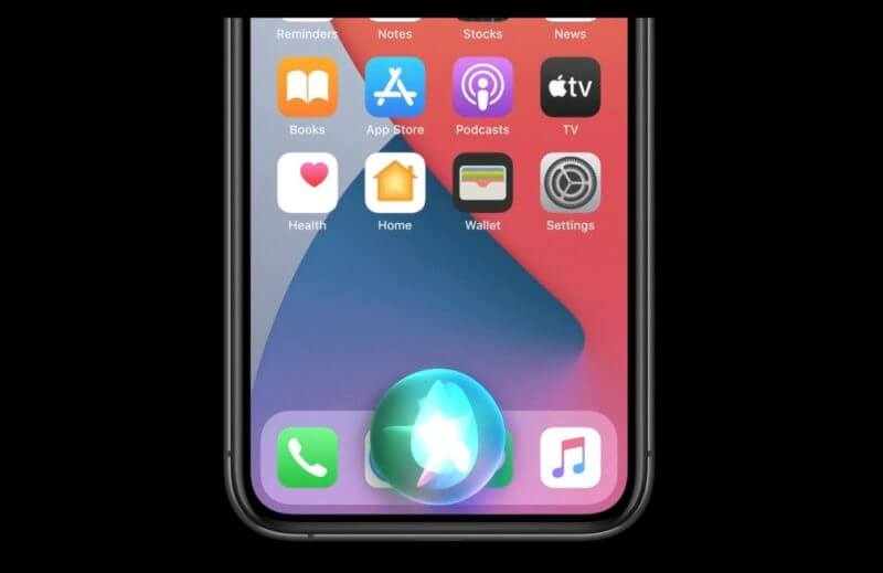
What the new Siri looks like. Here is a screenshot shown during the Apple WWDC virtual event Monday of the new Siri interface when activated in the new iOS 14. Notice, it no longer takes over the whole screen. All you see is an animated Siri circle logo at the bottom of the screen:
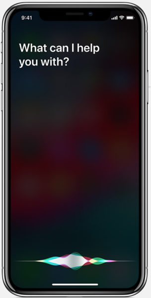
The old/current interface. Here is how Siri looks now, in iOS 13.

Siri has grown. Apple said that Siri handles 25 billion requests per month. Plus, Apple said that Siri now has twenty-times more facts than it did only three-years ago.
New translate app. Also, Apple announced a new Translate app. It is similar to the Google Translate app but something Apple is first getting into. Apple’s Translate app will launch supporting 11 languages including English, Mandarin Chinese, French, German, Spanish, Italian, Japanese, Korean, Arabic, Portuguese and Russian.
The translate app works offline and the conversations are private, Apple said.
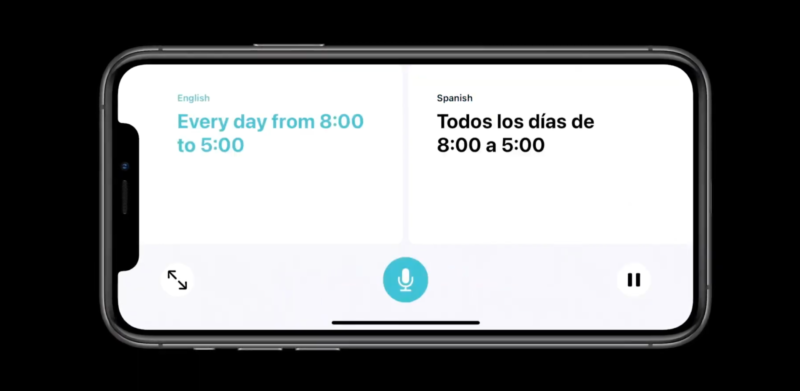
What it looks like. This is what the interface looks like:

Conversation mode. Also, with this new translate app is “conversation mode.” You turn the phone in landscape orientation and and it moves into conversation mode. It shows you side by side the conversation you are having with someone in different languages. And yes, it auto detects the language.

Why we care. Siri is the default voice assistant on iOS devices, Apple computers and also on CarPlay, which is on 97-percent of the new vehicles sold in the US and on over 80-percent of vehicles sold globally, Apple said. Siri is a popular interface for searching, but has lacked innovation and is not as powerful as Google. This redesign hopefully points to further Siri product investment and improvements by Apple.


